
case studies
Key Results
20% increase in conversion rate.
Client
Project Timeline
Client Relationship
Client Type
case study
Key Results
20% increase in conversion rate.
Client
Project Timeline
Client Relationship
Client Type
Key issues
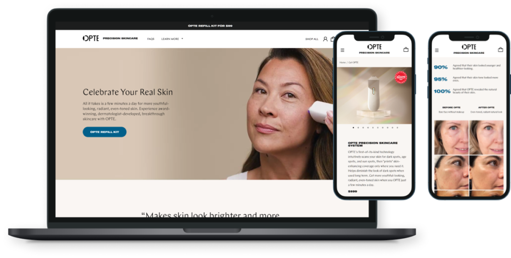
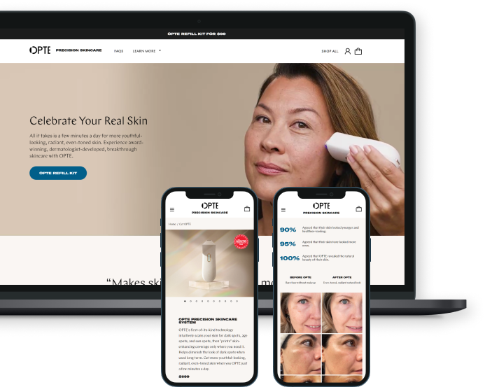
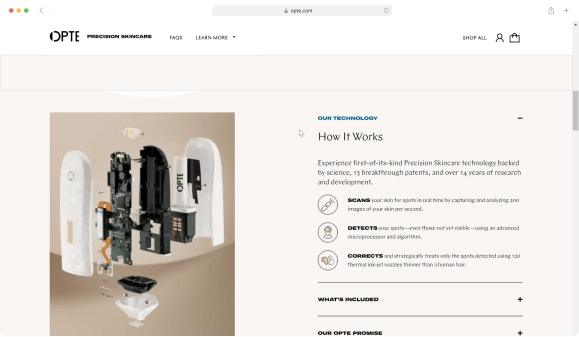
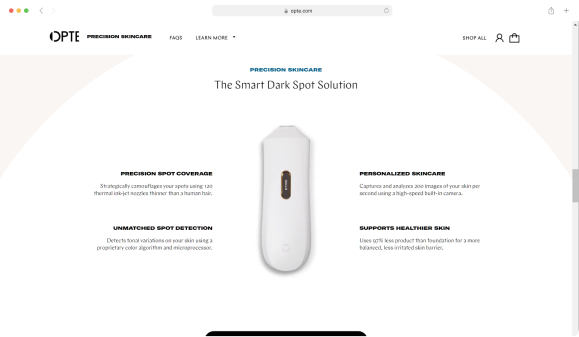
As a leader in advanced skincare technology, Opte had a revolutionary product backed by 13 patents and 14+ years of research and development. Their handheld device analyzes a customer’s face and applies a solution to combat hyperpigmentation, tailored to their unique face. It is an awesome product (that works!), with a lot of science and technology behind it, which was part of the problem they were having.
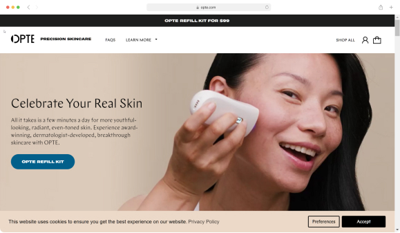
With so many great features and the advanced nature of the device, their site was cluttered with information and facts, which made for a distracting experience. They wanted to get their product in the hands of their customers with their website being the primary sales channel. That is why they asked First&Third to help them rebuild their Homepage and Product Detail page to tell the story of the product with updates to the design and layout of the site, improve the conversion rate with clear call to actions, and optimize the site for speed.
Key improvements
First&Third takes a collaborative approach with our clients and their teams. We were involved at the beginning of this project helping with strategy and providing UX input for the page designs. We ran collaborative workshops with the key stakeholders of the Opte team, set up weekly meetings to track project status, and communicated through Slack. See some of the work that we did below.
UX Improvements
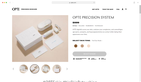
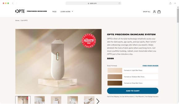
We collaborated with the design team to provide UX feedback on simplifying product customization and ordering. Customers could more clearly see what was offered, the price and add it to the cart.
Clearer features and benefits
Through user research and interviews, we found what mattered most to customers and highlighted the most impactful features. Customers could then understand what the device had to offer and how it could help them personally.
Optimized image sizes and improved site speed
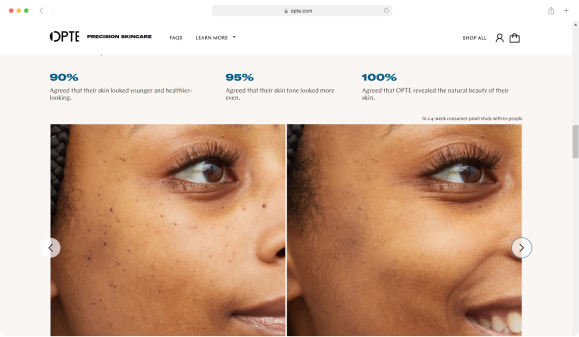
Showing how the device worked and the results it gave was critical to telling their story, but big beautiful images can slow websites down without proper coding. And slower sites have shown to drastically lower conversion rates on e-commerce sites. So we built a system to optimize their images for speed, without losing their impact and detail.
Added custom analytics tracking
The Opte team needed more information on what was resonating with customers and what wasn’t. We implemented custom analytics tracking and deeper Google Analytics features to more closely track their customer’s journey on the site. We could then pinpoint what was working and where in the funnel customers were dropping off.
Key Results
20% increase in conversion rate.
Before launch, we run exhaustive QA testing and ensure that you have time for testing as well. This gives you an opportunity to familiarize yourself with the site and gives us the chance to train you on managing the site going forward. Once we’re bug free, then we launch and monitor the site for any unforeseen issues over the next 30 days.
The new website was a great success and immediately started showing results. Customers were more quickly understanding what the product did and adding the product to the cart quicker. Overall, we saw a 20% increase in the conversion rate after the first month, a huge improvement.
We were also able to utilize the new analytics tracking to better plan their roadmap and target features and pages that would have the most impact on their conversion funnel.
After the launch of the project, Opte was so happy with the success that we continued to work with them on a monthly retainer to further optimize their site heading into the holiday shopping season.
Services Provided
Shopify Plus
E-commerce
Front-end development
Back-end development
Analytics
Strategy
User Experience (UX)
Site Speed Optimization
TESTIMONIALS
“Our redesign was a huge endeavor and getting that launched was a big step forward. We really appreciate your help getting this vision in place ahead of a critical time in the year and reaching this big milestone. It was very well received by our top investor!”
—Adam Rodriguez – Product Manager, Digital at Opte
TESTIMONIALS
“The F&T team is incredibly creative, thoughtful, and very engaged in their client’s business.”
—Opte Team
next up